Sunday, June 13, 2010

Project3: Art Gallery, Shop/ House


Project3: Art Gallery, Shop/ House


Project 3: Art Gallery, Shop/ House

This is the site model I made to the scale of 1:500
It gives a better understanding of the location of the site among the neighboring buildings.
I also made a mass model of my building ( in red color) to give the sense of its position on the site

Project 3: Art Gallery, Shop/House


The drawings are done by Revit program. I found it very useful and handy because it gives me the opportunity of having precise drawings with perspectives.

Project3: Art Gallery, Shop/ House

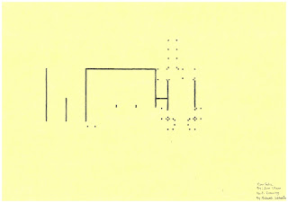
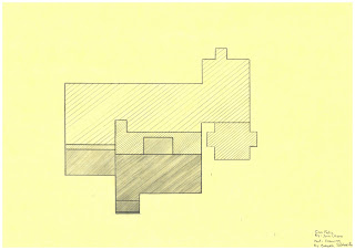
Poche drawing showing the play between light and dark in upper level plan plan
Poche drawing showing the play between light and dark in ground level plan


Parti drawing

Project 3: Art Gallery, Shop/House

Some of my key ideas for designing this space was :
  • Respecting the bohemian ambiance of the street (Decorum)
I didn't want to come up with a form that has nothing to do with the surroundings. My building is approximately the same height as the neighbors. It is expanded in 2 levels.I tried to keep the general form of the building simple and not too flashy.

  • Being in harmony with neighbors
To achieve this I kept the general idea of the facades of my neighboring buildings specially the Dendy Cinema.
  • catch as much sun light as possible
The site is sandwiched between two buildings so I catch the natural light from roof. I also used the idea of roof light on top of each sculpture so it will be like a natural light projection on top of each sculpture to emphasize and celebrate it.
There is also a sunny sculpture courtyard. I located it on back of the site where it is exposed to the north light which is very desirable.

  • A representer of the art work which is enveloped.
I went through the art works of my artist and got some inspirations from him. I got the idea of glass panels with steel frame and applied it in the big show room as well as the office .
  • Manage the sequence of spaces in a way that achieve the most comfort for my client and security for the art works.
For example the office is located between the main entrance from King Street and the big show room. This allows a good control for the visitors as well as the precious art works in the big show room.
The big show room is located in the middle of the built area. It is the center of the building which celebrates the art works. It has a good natural light gained from the top roof.
There is another access to the building from the parking adjacent to the site. This entrance is perfect for loadings. It has a wide entrance that allows the bulky stuff get in. There is a storage room close to this entrance.
There is also another entrance via the back street. From this entrance visitors get straight to the courtyard where garden sculptures of Jass are presented.
On the top level there is another showroom around the glass walls of the centered big showroom. This is where each sculpture is projected by sunroof light individually.
On one side of this level ( the King street side) there is a workshop and a gathering space (living room). The work shop next to the show room on top floor captures my artist's own interest in art, and his need to reengage with it, and also share the experience with others. Furthermore the living area next to it is perfect for break times and gatherings.

Also my client asked for a small bedsit (minimum 40square meters) adjacent to the gathering space ( living area). This is located on the other side of top floor. It has a view to the back courtyard and back street where there is a park. It also gains a lot of sun light as it faces north.


Project 3: Art Gallery, Shop/ House


I decided to present sculptures of Rudi Jass. I like his creations of water features and sculptures characterized by clean flowing lines, elegant forms and timeless design. that are equally at home in small courtyards or amid the strong shapes of bold modern architecture in urban and commercial developments. Stainless steel, copper and bronze are often combined with glass and stone in his distinctive style.
I got some inspirations from his ideas to apply in my design so the space would be in harmony with the art works and work as a frame for them.

Monday, May 31, 2010

project 3: Art Gallery, Shop/ House


Here are some of my attempts for site analysis. I have shown the neighboring buildings the circulation around the site by car and foot as well as the sound pollution on the king street, wind direction and the sunlight.

project 3: Art Gallery, Shop/ House

This project is about designing an art gallery with a residential part within. We could choose our site among 3 sites located on King street, Newtown. Among these sites, I had to decide which site could offer the most opportunities for playing with ideas of organisation of circulation and manipulating interesting lighting qualities. The one I chose was the longest and narrowest envelope and has a number of interesting contextual qualities: the unrestricted access to the Lennox St backstreet and Camperdown Memorial Rest Park; and the neighboring icons of student culture such as the Dendy Cinemas and small restaurants; and the almost maligning presence of the church.

This is the view from King street, my site is next to the Dendy Cinema


The opposite view from King street


Back street view of the site. There is a large Parking space next to the site which suits the future visitor of the site as well as easy access for deliveries.


opposit the site on backstreet


Sunday, May 9, 2010

"Room and Narrative"


My Materials would be glass, concrete coloured in white and Steel columns that support a glass roof. ( The roof is in glass because I want as much light as possible and I don't want any shades created by roof )

In this model I used Foam core boards representing white colored concrete for my base and my floors and 2 kind of perspex representing glass. The roof is also made by clear perspex.

"Room and Narrative"

I have designed two separated spaces connected to each other by rising stairs and under one glass roof. The two spaces are designed for seating inside and resting, or chatting.
These two spaces have different characteristics which is defined by two type of glass walls with defferent heights.The glass walls play an important role here. in the first space the walls are transparent so inside is visible from outside but in comparison with the second space, it has higher walls. Although this space has higher walls but there is not much privacy as every thing is visible from outside.
Three rising stairs lead you to the second space which has non transparent glass walls but lower than the first space. This space gives you the sense of being outside in the middle of the society while you are protected by the non transparent glass walls.

The two spaces are being lifted from the ground. My idea behind it was because the second space which is derived from Hopper painting shows an idea which is from his time, that was still suspended and doubtful and had not find it's place in society properly.

There is a wall 4 openings infront of the second space. This wall helps with the play of lights and shadows in the second space as well as improving the privacy of the second space.


Parti Drawing


Elevation

Plan

Axonometrics

"Room and Narrative"

Inspiration From Precedents:

I got some inspirations from Farnsworth House by Mies Van Dor Rohe. This building played an important role in moving from classics to modern architecture and I wanted to use its key features for my space as my space also shows the movement from classic moralities to new ones which suites the modern society better.

The key ideas I chose from this building was the materials which are glass, concrete and steel frame and white colour.

"Room and Narrative"

My Narrative is : A nonthreatening and comfortable space in the middle of a crowded and modern city for chatting.

My site is suppose to be on Hyde Park.
The reason I chose that, is because I was looking for an open space in the middle of a modern, crowded city among the high raised offices-which is part of our every day life- and I want to design a space to put all this mess behind and rest for a while.


"Room and Narrative"


Edward Hopper (July 22, 1882 – May 15, 1967) was a prominent American realist painter.In both his urban and rural scenes, his spare and finely calculated renderings reflected his personal vision of modern American life.[Sherry Maker, Edward Hopper, Brompton Books, New York, 1990, p. 6]


Chop Suey, 1929, Edward Hopper, american, 1882-1967, oil on canvas, 32*38 in. Collection of Barney A.Ebsworth


This is one of his paintings I became interested in. I think There is a lot to read in it. From women to the culture of that time and to the effects and impacts of it.

In Hopper's time, Women took their place in New York restaurants as never before. In restaurants hopper saw the changing face of the American woman. Victorian-era rules of feminine behavior were being discarded everywhere. For a proper woman, "dining out" traditionally meant eating in the company of a suitable escort, lest the lady be mistaken for a prostitute; typically only male businessmen or travelers dined in restaurants. When the discreet but friendly sign "Table for Ladies" appeared in the window, it signaled a restaurant's acceptance that society was changing.

In this painting newly liberated women who work, dine, live independently are being shown. They are seating by one of these Table for Ladies. As the window which they are seated by is half covered so they are not being watched or starred from outside and they feel more comfortable while they have good light inside. At the meantime, there is a couple seating behind them by a window which is not covered.The two women do not seem to be happy. They look like depressed or tired, maybe of the burdens or pressure on them occurred by new industrial and society revolution. Maybe the only thing which calms them down is talking to each other. What they need is a place of refuge, comfortable, nonthreatening environment.

Although this is clearly a figurative work, Hopper flirts with abstraction. The women are surrounded by a balance of geometric forms: the angular table between them, the layers of rectangles that animate the foreground window, and the blue and yellow patches visible through the far window that suggest shafts of light on the adjacent building.

Thursday, April 8, 2010

Villa Can Feliz, Drawings(Week 4,last submission)

Parti Drawings:
Enclosure and the placement of columns

Movement through the building

Platforms and level difference


Poche Drawings:
In this poche I have tried to show the impact of light in the building, solids, cavities, different levels as well as some key furniture inside the building.
Section through living room
(in this section different levels, different spaces and different experiences through possible activies via the house are tried to be shown)


Elevation

Villa Can Feliz, Model(Week 4, last submission)


Thursday, March 25, 2010

Villa Can Feliz (Week 3)


This week me and 2 of my friends (Tony and Rio) were busy with making the model of Villa Can Feliz. I also did some more attempts for drawing the parties and poches. I showed my drawings to my tutor during our studio class and he gave me some useful advises.
Here I attach some of the drawings: